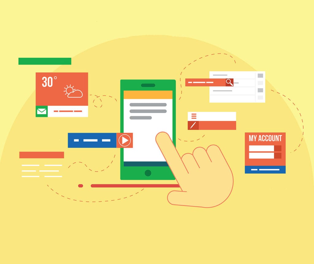
With PC sales plummeting and mobile traffic on the rise, responsive email-marketing is becoming a valuable asset to any business. There are a number of reasons as to why this is important and evidence to suggest that your campaign success can be solely based on it.
Read on to see our endorsement for designing emails responsively:
What is Responsive Design?
Responsive design is a simple concept, created to keep your digital products looking good on any viewing portal, no matter what its size. Ultimately, this generally pans out as multi-column layouts for landscape tablet screen sizes and larger – and single column design for anything smaller.
In general, the design stays the same but the formatting changes. We are also able to hide elements on smaller or larger screens if we feel they will be ineffective elements at that scale.
Why is Responsive Design Important?
You’re guilty of it right? Checking your emails when you’re out and about? Work, personal or other accounts, we all do it. Let’s face it, if you don’t you’re fighting a snowstorm, already buried six feet under.
This is illustrated by the fact that 60% of emails are opened on mobile phone or tablet. On top of this 38% of click troughs occur from this format also.
Ultimately, it boils down to usability. Emails that are sent un-responsive generally provide the reader with a poor experience. This not only effects your brand image, but often means your marketing budget heads straight to their trash.
When Should I Apply Responsive Design?
Now! The longer you wait, the more your wasting your time and your money. To increase response and improve brand awareness, you should be implementing these changes ASAP. You are better off sending less emails in a responsive format than lots in an unusable format.
How Will Responsive Design Help Me?
Response. 80% of marketers state that their revenue is “directly linked” to their email operations. By creating a mobile-friendly format you make it easier for prospects to click through to your site. You also make your brand more appealing and who doesn’t want that.
How Do I Make the Most of Responsive Design?
There are a number of different things you can do to make the most of responsive design. If you have some time on your hands have a play and test send emails to yourself. It’s the best way to learn what does and doesn’t work for your business. However, if you’re pushed for time you could always give the following a try;
- Keep content to a minimum so the email can be scanned quickly. Readers spend an average of 17 seconds on each email.
- Keep text alignment consistent throughout your message.
- Favour percentage division over fixed size for tables and other elements.
- Use larger imagery (more than 300px) and keep all images consistently sized.
- Avoid large white spacing
- Ensure your margins remain equal on all sides
- Whatever you do, do not delete the <head> tag. Doing so will render your email unresponsive.
- Test, test, test. There are plenty of services out there to help you view your email in multiple platforms and browsers prior to send. (Try Litmus or Email on Acid).
Who Can Help Me with Responsive Design?
We can! Here at Everything DM, we’ve been applying responsive design techniques to all of our emails for quite some time and without blowing our own trumpet too much, we’ve become quite good at it.
If you need advice, a one-off email or multiple templates set-up then we’re on hand to help. Just call us on +44 (0) 1462 437 555 or email [email protected]


